🧩 Icons Settings #
This section allows you to customize the appearance and behavior of all icons used in the responsive menu. These settings help ensure your menu’s icons are both visually appealing and functionally clear across devices.
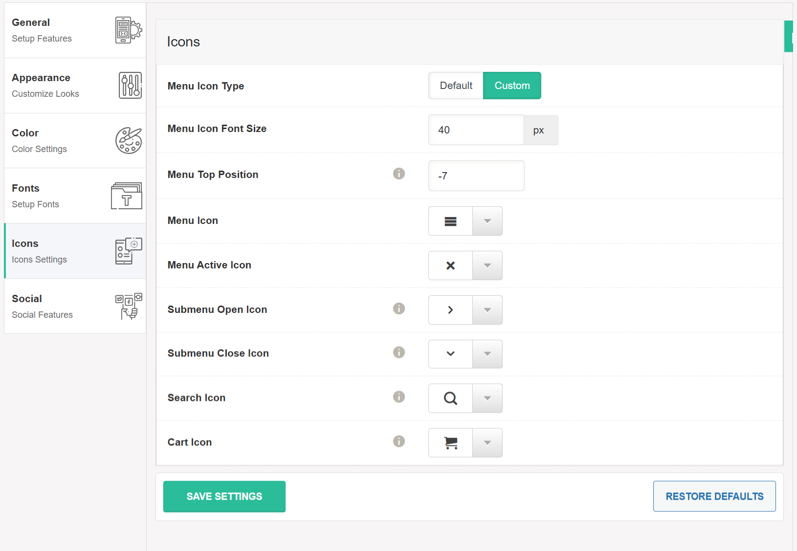
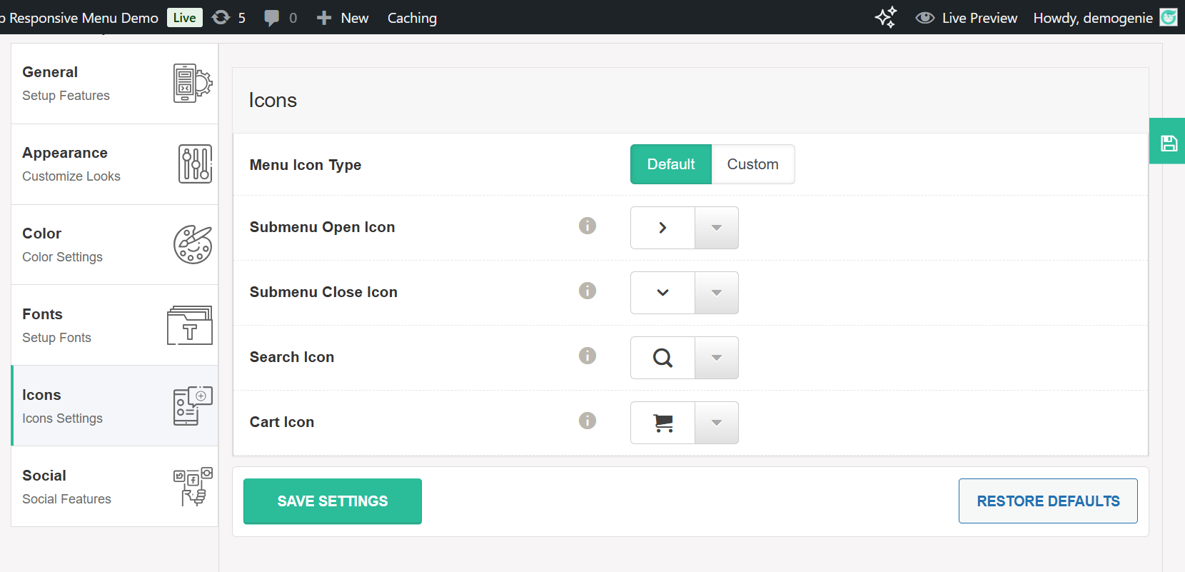
🎨 Menu Icon Type #
Choose between two icon styles:
-
Default – Uses the pre-configured icon style provided by the plugin.
-
Custom – Allows you to choose your own icon styles for each menu element.
🔠 Menu Icon Font Size #
Define the size of all menu-related icons (in pixels).
For example, setting it to 40px will make all menu icons 40 pixels in size.
↕️ Menu Top Position #
Fine-tune the vertical alignment of the menu icon.
You can adjust this value (positive or negative) to align the icon perfectly with your design. E.g., -7 shifts the icon upward.
📑 Menu Icon #
Select the icon that represents the menu toggle (usually the “hamburger” icon). This is the icon users click to open the menu.
❌ Menu Active Icon #
Defines the icon that appears when the menu is opened or active. Commonly this is an “X” or close icon, replacing the menu toggle icon.
➤ Submenu Open Icon #
Choose the icon that will be shown next to parent menu items that contain submenus. This icon indicates to the user that more items are nested underneath.
⬇️ Submenu Close Icon #
This icon is displayed when a submenu is expanded. Clicking it collapses the submenu. It’s often a downward-facing arrow or similar indicator.
🔍 Search Icon #
Select the icon that represents the search feature within the menu. Commonly shown as a magnifying glass.
🛒 Cart Icon #
Choose the icon for the shopping cart (if WooCommerce integration is enabled). This icon typically displays item count and links to the cart page.
Icon options with Default:
Icon options with Custom: