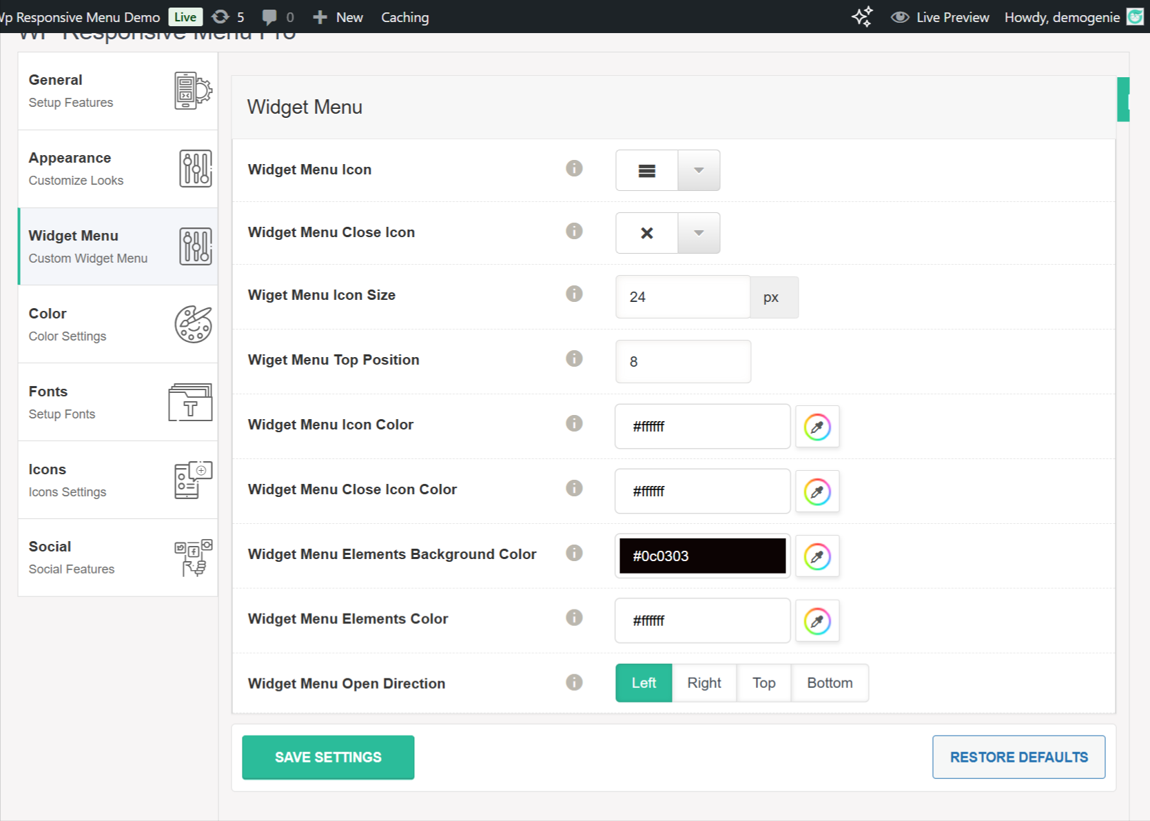
🧱 Widget Menu Settings #
This section allows you to fully customize the appearance and behavior of your widget menu. These settings help ensure the widget menu aligns seamlessly with your overall site design.
📑 Widget Menu Icon #
Select the icon to represent the widget menu toggle button (usually a hamburger icon). This icon is what users will click to open the widget panel.
❌ Widget Menu Close Icon #
Choose the icon that appears when the widget menu is open. Typically, this is an “X” symbol that allows users to close the widget panel.
🔠 Widget Menu Icon Size #
Define the size of the widget menu icon in pixels (e.g., 24px). Adjust this to match your site’s layout and styling needs.
↕️ Widget Menu Top Position #
Fine-tune the vertical alignment of the widget menu icon using this value. Positive or negative numbers shift the icon up or down as needed.
🎨 Widget Menu Icon Color #
Set the color of the widget menu icon. This determines how the icon appears before the menu is opened.
🎨 Widget Menu Close Icon Color #
Customize the color of the close icon, which is shown after the widget menu is opened.
🖼 Widget Menu Elements Background Color #
Set the background color for the widget panel itself. This is the container that holds all your widgets.
🎨 Widget Menu Elements Color #
Choose the text and element color used within the widget menu, ensuring readability and visual contrast with the background.
↔️ Widget Menu Open Direction #
Specify the direction from which the widget menu will slide into view:
-
Left
-
Right
-
Top
-
Bottom
Choose the position based on your layout and design preference.
Widget Menu options screenshot:
#


